Amazon rolls out an App update — here’s what I think as a UX designer

Amazon has been gaining its popularity for various reasons including its variety of products, high cost performance, fast delivery and good customer service experience. In fact, the user experience of the website and mobile app of a company is a crucial part of the E-commerce shopping experience as well.
The Amazon App has been around forever without much change in its UI. There have been a lot of questions on Quora like “Why doesn’t Amazon change their UI?”. One of the answers on Quora is that “they don’t want to change something that works.” As a company with over 150 million users, they do need to be cautious when changing the design of the mobile app.

Surprisingly, the latest version of Amazon mobile app has changed significantly compared to the previous version. Let’s check out what’s new.
Tab Bar
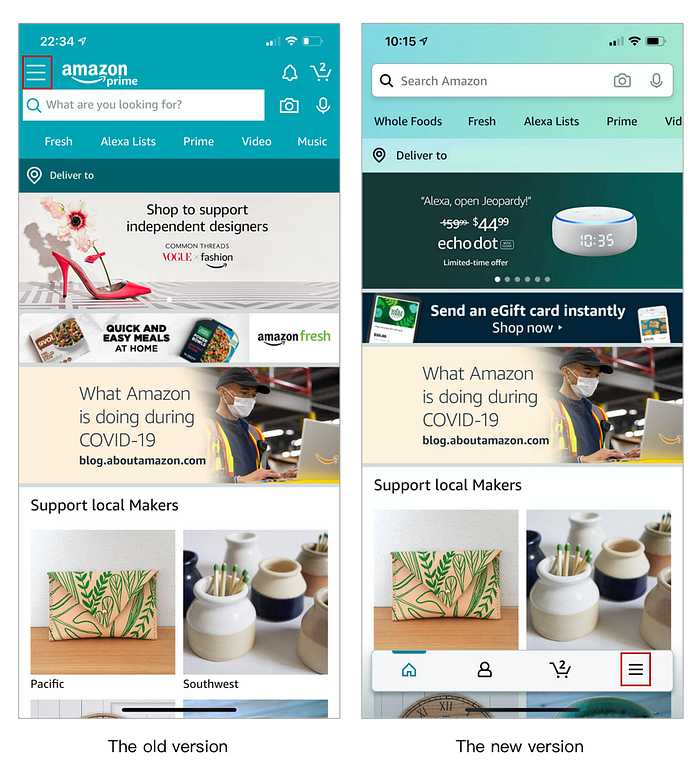
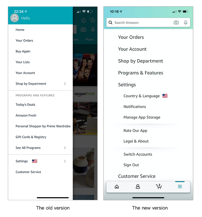
The first noticeable change is a floating tab bar at the bottom. There are four icons on the tab bar: homepage, profile, shopping cart and the drawer menu.

In the previous version, the drawer menu icon is on the top left. According to the Mobile Thumb Zone (A study conducted by Steve Hoober), the top left area is not very accessible for users (either right-handed or left-handed). The relocation of these important features from top left to the bottom tab bar makes them more accessible for users.
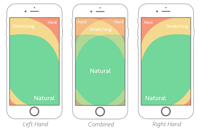
Besides, the tab bar in the Amazon App is slightly different from the traditional tab bar. The location of the floating tab bar is slightly higher than common design in most of the mobile apps where the tab bar is located at the very bottom (right at the bottom edge of the screen). Its location is within the scope of the “Natural” area for both right-handed and left-handed users. Another App with similar design is Pinterest. Both Apps require a lot of scrolling up and down to access their contents.
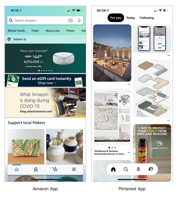
With all the advantages of a floating tab bar discussed above, are there any disadvantages? It is obvious that the tab bar takes a certain amount of space and could be interrupting to some degree compared to the previous version especially when users are scrolling down (where the finger starts moving from the bottom of the screen). More user research needs to be done to find out how it influences the experience for scrolling up and down.
In addition, Your Order and Your Account are located both within the drawer menu and in the profile page. Redundant entries for the same feature would increase users’ cognitive workload during the navigation. It might be better to only have these features in the drawer menu like the previous version.

Drawer Menu
Which one is better, a drawer menu on the top left or a tab bar at the bottom? There has been a debate for a long time about which option is better for navigation. Although the question is not settled yet, tab bar is more commonly used in B2C Apps.
The number of tabs in the tab bar suggested by the Apple Human Interface Guidelines is between three and five. When more than five tabs are needed on the tab bar, a drawer menu tab will be added on the tab bar to include more features. Yelp and Facebook both adopted this option in their mobile apps.

This design option was also used in the latest Amazon App with all the important features accessible from the bottom tab bar. However, for users who have been using the Amazon mobile app for years, they are already used to the drawer icon on the top left. It might take time for them to adapt to the new location even though it is more accessible.
Shopping Cart Icon
In the previous version, the shopping cart icon was located at the top right corner and has similar position and UI style as the other three icons for notification, camera and voice input, which resulted in the shopping cart icon not being prominent and weak in recognition.
In the new version, the shopping cart icon has been moved from the top right corner to a prominent position on the bottom tab bar, greatly increasing the accessibility of this feature. Such a change would effectively allow users to notice the presence of the shopping cart icon during a quick scan, reminding them to check out items already in the cart, and subsequently increasing the conversion rate.

Color
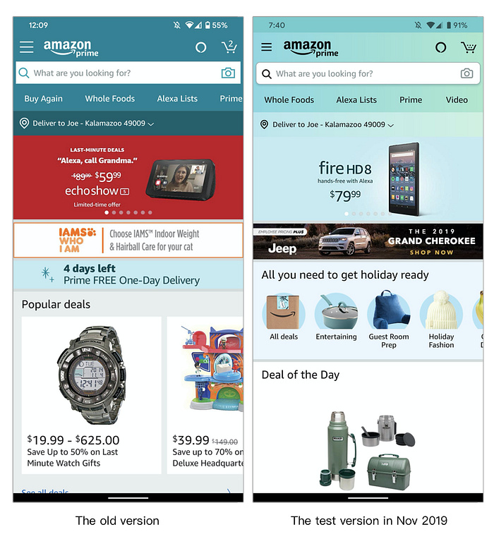
The new version also has a significant change in its color scheme, a rarity in Amazon’s previous updates. The old version used turquoise in background and white in fonts, while the new version uses the gradient color palette that has become popular in recent years and combines it with black fonts.
In terms of contrast between background and text, the color contrast ratio of the old version is about 3:1, which meets the minimum contrast requirement of Web Content Accessibility Guidelines (WCAG). The minimum contrast ratio of the new color scheme is about 13:1, which is a significant improvement from the previous version and greatly improves the user’s reading experience. A gradual cyan — spring green palette also makes the interface look more stylish and modern.
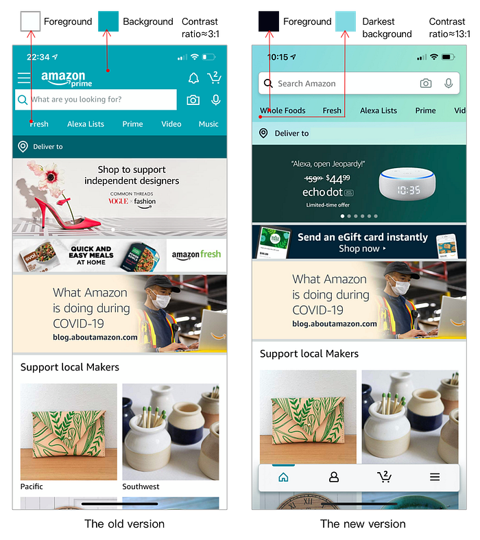
In fact, Amazon did a AB test back in November 2019, before any changes were made to the layout. This time around, the update follows the color scheme in the last test version, proving that the new color scheme has received positive user feedback.
Others
In addition to the above significant changes, there are a number of minor changes that reflect the current trends in UI and UX design.
- The logo and notification icons at the top of the page have been removed, a change that functionally relates to the change of navigation and visually presents a cleaner interface.
- The icons for camera and voice input have been moved into the search bar, which more clearly indicates that the camera and voice input are both options for search.
- Both the shapes of the search bar and the camera icon now have rounded corners, and the search bar now has a shadow added to it.

There have also been some other accessibility improvements, such as a larger font for the drawer menu list, which is easier to read and tap compared to the old version.
Overall, the new Amazon App does not completely abandon the original design. Although there are some UI and UX changes, it should be very familiar to experienced users. This release is also likely to be a test version in its recent iterations, hopefully there will be further improvements in its future releases.